Inline Lists and Graph Visualizations in Scheduled Platform Analytics Data Visualizations in Yokohama

For years, scheduled reports have been the standard solution for automatically exporting and sharing platform data with stakeholders on a regular cadence. One limitation with this solution that I've often received complaints about, however, has been its reliance upon a document (PDF or Excel, depending on the type of report) attached to the automated email, with no option to display the content inline. This solution gets the job done, but requires additional clicks to view the relevant content and especially complicates things on mobile mail clients. As with most things in the ServiceNow platform, creative solutions have provided workarounds that allow for system administrators to better meet stakeholders' user experience expectations. With the Yokohama release, this often-requested feature is available out-of-box for Data Visualizations as part of ServiceNow's Platform Analytics Experience.
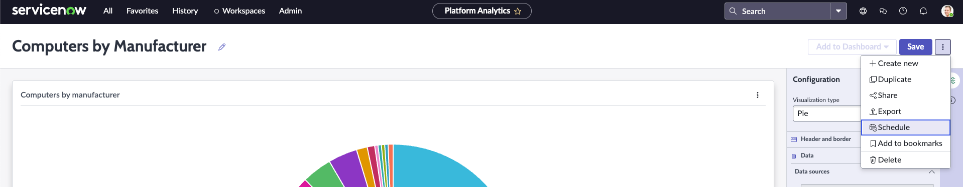
Scheduling inline content exports
While not explicitly called out in the product documentation, the Yokohama release includes a few somewhat hidden options in the scheduled export screen that allow for a bit more flexibility in how scheduled Data Visualization exports are rendered.
To kick things off, you'll want to navigate to All > Platform Analytics > Library and select Data Visualizations. It's worth noting here that these same options are not available for Dashboards at this time (and possibly won't be in the future, due to the volume of content these can contain), though the ability to export entire Platform Analytics Dashboards on a schedule as PDF or PowerPoint files is pretty convenient.
Once you've selected the Data Visualization you'd like to embed in an email, you'll want to open the Schedule screen.
From here, you'll want to drill into the File type dropdown menu.
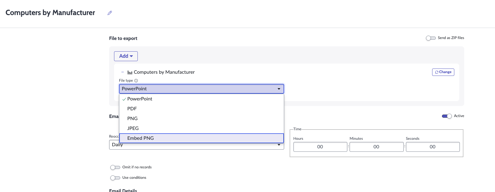
The exact options available are dependent on the type of Data Visualization you're trying to schedule. The screenshot above is from a "Pie" visualization, while "List - Simple" visualizations will include an "Embed LIST" option.
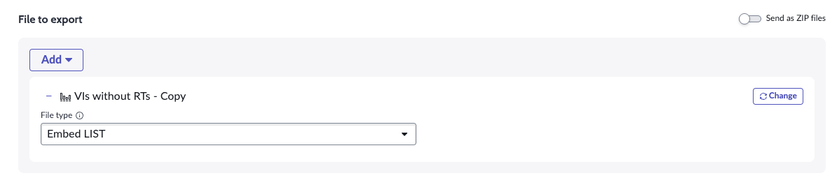
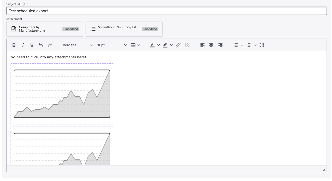
Using the "Add" button, you're able to include multiple Visualizations to embed in a single scheduled export.
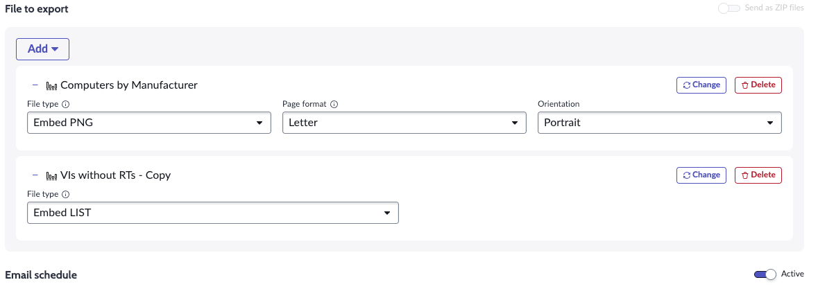
With at least one "Embed" option selected, you're able to modify the exact email contents in the "Email Details" section below. The embedded content is added to the WYSIWYG editor in the order in which it was added.
Once the content is arranged as you'd like and at least one recipient is configured, you can test the export by saving and clicking the "Send Now" button.
Results
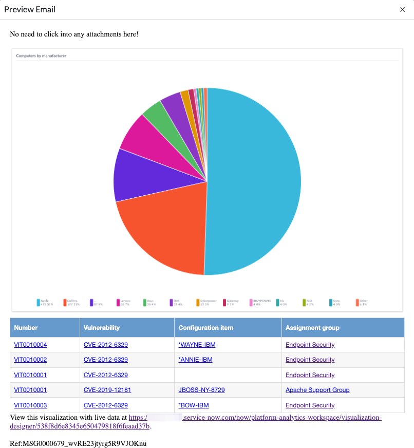
Immediately upon testing, you should be able to preview the generated email in your system's
Nuances and limitations
This is a very exciting new feature, but there are a handful of things to note before diving in fully.
- If embedding multiple Visualizations, it can be a bit difficult to differentiate them in the WYSIWYG.
- For "List - Simple" visualizations, a raw HTML table is always output including links to all reference records in the Core UI. Workspace links are not supported, and Group By options do not result in multiple tables being generated. The styling of the table and the text that appears below it linking to the Visualization in-platform both seem to be hard-coded, which limits flexibility and potentially the audience of these notifications to users with Platform Analytics access.
- From what I can see, there does not appear to be any support for any kind of company branding in the generated exports using any existing features like Email Templates or Layouts.
Despite these points, this feature requires no custom code and empowers reporting power users to create friendlier experiences for a variety of personas.